1.5 Input
Learning Objectives
- Build interactive user interfaces with the
Pressablecomponent - Create reusable components that accept props as parameters
- Type component props using TypeScript interfaces for type safety
- Manage state using the
useStatehook to store data that changes - Understand how state changes trigger re-renders and update the UI
Pressable vs Button
Section titled “Pressable vs Button”Now that we have reusable components, we need a way to handle user interactions. React Native provides two main components for handling press events: Pressable 1 and Button 2.
Pressable Component
Section titled “Pressable Component”Pressable is the flexible, low-level component for handling press events. It wraps any content and gives you complete control over the appearance and behavior.
Key features:
onPresscallback: Triggered when the user taps/clicksstylefunction: Accepts thepressedstate to apply different styles when held downdisabledprop: Prevents interaction whentrue- Android ripple effect: Native Android Material Design ripple via
android_rippleprop - Full customization: You control all aspects of the visual design
<Pressable onPress={() => alert('Button pressed!')} disabled={false} style={({ pressed }) => ({ backgroundColor: pressed ? '#0051D5' : '#007AFF', opacity: pressed ? 0.7 : 1, })} android_ripple={{ color: 'rgba(255, 255, 255, 0.3)', foreground: true, }}> <Text>Press me</Text></Pressable>When you press and hold on iOS, pressed becomes true, and the styles update instantly. On Android, you get a native ripple effect that emanates from the touch point. This is the Material Design standard that Android users expect.
Button Component
Section titled “Button Component”The Button component is a simple, pre-styled button that follows platform conventions. It’s quick to use but has limited customization.
Key features:
- Pre-styled for each platform (iOS blue, Android Material Design)
- Only accepts
title(string),onPress,color, anddisabledprops - Not meant to be customized heavily
- Good for quick prototypes or system-standard buttons
<Button title="Press me" onPress={() => alert('Button pressed!')} color="#007AFF" disabled={false}/>When to Use Each
Section titled “When to Use Each”Use Pressable when:
- You need custom styling (borders, padding, gradients, shadows)
- You want to wrap complex content (images, multiple Text components, icons)
- You need platform-specific press feedback (ripple on Android, opacity on iOS)
- You’re building a reusable component library (like our custom Button)
Use Button when:
- You need a quick, platform-standard button for prototyping
- You don’t care about custom styling
- You want the default platform look and feel
What Are Props?
Section titled “What Are Props?”Components become truly powerful when you can pass data into them. Props (short for “properties”) are like function parameters for components. They let you customize how a component behaves and looks without rewriting the code.
Think of a button component like a pizza restaurant: the restaurant (component) stays the same, but you can customize what goes on the pizza (props) each time you order.
// Without props: the component is always the same<Button />
// With props: you can customize it<Button label="Save" onPress={handleSave} /><Button label="Cancel" onPress={handleCancel} /><Button label="Delete" onPress={handleDelete} disabled={true} />Every time you use <Button />, you can pass different props to make it behave differently. React passes those props to your component function like arguments:
// Props are just parametersfunction Button(props) { return ( <Pressable onPress={props.onPress}> <Text>{props.label}</Text> </Pressable> );}Custom Button Component
Section titled “Custom Button Component”Let’s create a Button component that accepts props and becomes the pattern you’ll use throughout this course.
- Define what props the component accepts
- Use those props to customize the appearance and behavior
- Reuse it everywhere in your app
function Button({ label, onPress }) { return ( <Pressable onPress={onPress}> <Text>{label}</Text> </Pressable> );}
// Use it anywhere with different propsexport default function App() { return ( <View> <Button label="Save" onPress={() => alert('Saved!')} /> <Button label="Cancel" onPress={() => alert('Cancelled')} /> </View> );}The magic here is reusability: you wrote the button logic once, and now you can use it a hundred times with different labels and behaviors.
TypeScript Interfaces for Props
Section titled “TypeScript Interfaces for Props”Right now, you can pass any props to your Button component, even ones that don’t make sense. What if you pass label={123} (a number instead of a string)? Or forget the onPress prop entirely?
TypeScript interfaces solve this problem. An interface is a “contract” that tells TypeScript exactly what props a component expects and what types they should be.
Defining a Props Interface
Section titled “Defining a Props Interface”interface ButtonProps { label: string; // Must be a string onPress: () => void; // Must be a function that returns void disabled?: boolean; // Optional (the ? means optional) variant?: 'primary' | 'secondary'; // Optional, but only these two values}
function Button({ label, onPress, disabled = false, variant = 'primary',}: ButtonProps) { // Now TypeScript knows exactly what types to expect // If you pass label={123}, TypeScript will show an error ❌ // If you forget onPress, TypeScript will show an error ❌ return ( <Pressable onPress={onPress} disabled={disabled}> <Text>{label}</Text> </Pressable> );}Why Interfaces Matter
Section titled “Why Interfaces Matter”When you use your Button component, TypeScript auto-completes the props and catches errors at development time:
// ✅ TypeScript approves<Button label="Save" onPress={handleSave} disabled={false} />
// ❌ TypeScript catches it immediately<Button label={123} onPress={handleSave} />// ^^^ Error: Type 'number' is not assignable to type 'string'
// ❌ TypeScript catches the missing prop<Button label="Save" />// ^^^ Error: Property 'onPress' is missingEvery button in your apps can be a component like this, with a props interface that defines what makes it unique. By using interfaces now, you’re building the same patterns that professional apps use.
State Management with useState
Section titled “State Management with useState”So far, all our components are static. They display the same thing every time they render. Real apps need to remember data and update the UI when that data changes. This is where state comes in.
State is data that changes over time and needs to be tracked by React. When state changes, React re-renders the component with the new data.
The useState Hook
Section titled “The useState Hook”React provides the useState hook to add state to functional components:
import { useState } from 'react';
export default function Counter() { // useState returns: [currentValue, functionToUpdateIt] const [count, setCount] = useState(0); // ^ ^ ^ // | | initial value // | setter function // current value
return ( <View> <Text>{count}</Text> <Button label="Increment" onPress={() => setCount(count + 1)} /> </View> );}When you press the button:
setCount(count + 1)is called- React re-runs the component function
countis now the new value- The UI displays the updated count
- User sees the change instantly
Let’s see this in action:
How State Works (Step-by-Step)
Section titled “How State Works (Step-by-Step)”
This is the core of React: state changes → component re-runs → UI updates.
Multiple State Variables
Section titled “Multiple State Variables”Your component can have multiple useState calls:
const [count, setCount] = useState(0);const [name, setName] = useState('John');const [isPressed, setIsPressed] = useState(false);
// Each state is independentsetCount(count + 1); // Only updates count, re-renderssetName('Jane'); // Only updates name, re-renderssetIsPressed(!isPressed); // Only updates isPressed, re-rendersCombining Props + State
Section titled “Combining Props + State”The real power emerges when you combine props and state. Props are “input” (parent → child), and state is “memory” (component remembers its own data).
A component can:
- Receive props from its parent
- Manage its own state internally
- Update state based on user interaction
- Display both props and state in the UI
interface CounterProps { initialValue?: number; // Parent can set the starting value onCountChange?: (newCount: number) => void; // Parent can listen for changes}
function Counter({ initialValue = 0, onCountChange }: CounterProps) { const [count, setCount] = useState(initialValue);
const increment = () => { const newCount = count + 1; setCount(newCount); onCountChange?.(newCount); // Tell parent about the change };
return ( <View> <Text>{count}</Text> <Button label="Increment" onPress={increment} /> </View> );}Deeper Dive: Why Re-renders Happen
React only re-renders a component when:
- State changes:
setCount(5)causes a re-render - Props change: Parent passes different props
- Parent re-renders: If the parent re-renders, children re-render too
React does NOT re-render on:
- Regular variable changes:
count = count + 1(no effect) - Nested object mutations:
obj.name = 'John'(no effect) - Array mutations:
arr.push(1)(no effect)
This is why state (with useState) is necessary, it tells React “something changed, please re-render.”
Bad (won’t update UI):
let count = 0;<Button onPress={() => count++} />; // UI stays the sameGood (will update UI):
const [count, setCount] = useState(0);<Button onPress={() => setCount(count + 1)} />; // UI updatesDeeper Dive: Component Composition & Lifting State
Sometimes multiple components need to share state. The pattern is called “lifting state up”: move the state to a common parent component.
// ❌ Bad: Counter1 and Counter2 can't communicatefunction Counter1() { const [count, setCount] = useState(0); return <Text>{count}</Text>;}
function Counter2() { const [count, setCount] = useState(0); return <Text>{count}</Text>;}
// ✅ Good: Parent manages shared statefunction App() { const [count, setCount] = useState(0);
return ( <View> <Counter value={count} onIncrement={() => setCount(count + 1)} /> <Counter value={count} onIncrement={() => setCount(count + 1)} /> </View> );}
function Counter({ value, onIncrement }) { return <Button onPress={onIncrement} label={`Count: ${value}`} />;}Now both counters share the same state. This is a fundamental React pattern: “props flow down, events flow up”.
Text Input
Section titled “Text Input”So far, we’ve only worked with buttons and counters. Real apps need to capture text from users like names, emails, search queries, messages, and more. React Native provides the TextInput 3 component for this purpose.
Basic TextInput
Section titled “Basic TextInput”You manage TextInput’s value with state, just like any other form element.
import { TextInput, View } from 'react-native';import { useState } from 'react';
export default function App() { const [text, setText] = useState('');
return ( <View> <TextInput value={text} onChangeText={setText} placeholder="Enter your name" style={{ borderWidth: 1, borderColor: '#ccc', padding: 12, borderRadius: 8, }} /> <Text>You typed: {text}</Text> </View> );}Key props:
value: The current text (from state)onChangeText: Function called when text changes (updates state)placeholder: Hint text shown when emptystyle: Visual styling (border, padding, colors, etc.)
Keyboard Types
Section titled “Keyboard Types”Mobile keyboards can be optimized for different types of input. Use the keyboardType prop to show the appropriate keyboard:
| Type | Best For | Keyboard Features |
|---|---|---|
default | General text | Standard keyboard |
email-address | Email inputs | @ and . easily accessible |
numeric | Numbers only | Number pad (0-9) |
phone-pad | Phone numbers | Phone dial pad with * and # |
number-pad | PIN codes | Number pad (iOS only) |
decimal-pad | Decimal numbers | Number pad with decimal point |
url | Web addresses | / and .com easily accessible |
web-search | Search queries | ”Search” or “Go” button |
// Email input with appropriate keyboard<TextInput value={email} onChangeText={setEmail} placeholder="Email" keyboardType="email-address" autoCapitalize="none" autoCorrect={false}/>
// Numeric input for age<TextInput value={age} onChangeText={setAge} placeholder="Age" keyboardType="numeric"/>
// URL input<TextInput value={website} onChangeText={setWebsite} placeholder="Website URL" keyboardType="url" autoCapitalize="none"/>Other Useful Props
Section titled “Other Useful Props”-
Security and Formatting:
secureTextEntry={true}: Hides text (for passwords)autoCapitalize="none": Don’t auto-capitalize (for emails/usernames)autoCorrect={false}: Disable autocorrect (for usernames/codes)multiline={true}: Allow multiple lines of text
-
Behavior:
maxLength={100}: Limit character counteditable={false}: Make read-onlyautoFocus={true}: Focus input on mountreturnKeyType="done": Customize keyboard return key label
// Password input<TextInput value={password} onChangeText={setPassword} placeholder="Password" secureTextEntry={true} autoCapitalize="none" autoCorrect={false}/>
// Multi-line text area<TextInput value={bio} onChangeText={setBio} placeholder="Tell us about yourself" multiline={true} numberOfLines={4} style={{ height: 100, textAlignVertical: 'top' }}/>Keyboard Management
Section titled “Keyboard Management”On mobile devices, the keyboard takes up significant screen space. When it appears, it can cover input fields or important UI elements. React Native provides KeyboardAvoidingView 4 to solve this problem.
The Problem
Section titled “The Problem”Without keyboard management, the input field might be hidden behind the keyboard:
// ❌ Input gets covered by keyboard<View style={{ flex: 1, justifyContent: 'flex-end' }}> <TextInput placeholder="Type here..." /></View>KeyboardAvoidingView
Section titled “KeyboardAvoidingView”KeyboardAvoidingView automatically adjusts its position when the keyboard appears:
The official docs 5 say that the behavior prop:
Specify how to react to the presence of the keyboard. Android and iOS both interact with this prop differently. On both iOS and Android, setting
behavioris recommended.Type
enum('height', 'position', 'padding')
… and that’s it. I can’t figure out what that means exactly. So if you ever find out, let me know!
Deeper Dive: Dismissing the Keyboard
Sometimes you want to dismiss the keyboard programmatically (e.g., when the user taps outside the input or submits a form). Use the Keyboard API:
import { Keyboard, TouchableWithoutFeedback } from 'react-native';
// Dismiss keyboard when tapping outside inputs<TouchableWithoutFeedback onPress={() => Keyboard.dismiss()}> <View style={{ flex: 1 }}> <TextInput placeholder="Type here..." /> </View></TouchableWithoutFeedback>;You can also dismiss the keyboard when the user presses the “Done” button:
<TextInput onSubmitEditing={() => Keyboard.dismiss()} returnKeyType="done" />Deeper Dive: Keyboard Listeners
For more control, you can listen to keyboard show/hide events:
import { Keyboard } from 'react-native';import { useEffect, useState } from 'react';
export default function App() { const [keyboardVisible, setKeyboardVisible] = useState(false);
useEffect(() => { const showListener = Keyboard.addListener('keyboardDidShow', () => { setKeyboardVisible(true); }); const hideListener = Keyboard.addListener('keyboardDidHide', () => { setKeyboardVisible(false); });
return () => { showListener.remove(); hideListener.remove(); }; }, []);
return <Text>Keyboard is {keyboardVisible ? 'visible' : 'hidden'}</Text>;}This is useful for hiding/showing UI elements when the keyboard appears (e.g., hiding a bottom tab bar).
Exercises
Section titled “Exercises”To practice building interactive components, complete the three exercises below. Save each Snack to your account and submit your links on Moodle.
- Click the external link icon (top-left of each Snack) to open in a new tab.
- Click the blue “Save” button to save to your account.
- Copy the Snack URL once completed and submit on Moodle.
Build a score tracker for two teams.
- Add state for
teamAScoreandteamBScore(both initialize to 0) - The “Team A +1” button should increment teamAScore
- The “Team B +1” button should increment teamBScore
- The “Reset Scores” button should set both back to 0
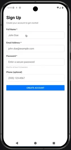
Build a complete signup form with multiple input types and keyboard handling.
- Create state for
name,email,password, andphone(all initialize to empty strings) - Create a
handleSubmitfunction that:- Validates that name, email, and password are not empty
- Shows an alert welcoming the user by name and showing their email
- Resets all form fields after successful submission
- Render TextInputs for:
- Name: with
autoCapitalize="words"andreturnKeyType="next" - Email: with
keyboardType="email-address",autoCapitalize="none",autoCorrect={false}, andreturnKeyType="next" - Password: with
secureTextEntry={true},autoCapitalize="none", andreturnKeyType="done" - Phone (optional): with
keyboardType="phone-pad"and proper styling
- Name: with
- Wrap everything in
KeyboardAvoidingViewwith platform-specificbehavior - Add a submit button that calls
handleSubmit
Hints
For the score tracker:
- Create two state variables (one for each team)
- Create functions for each button:
const addTeamA = () => setTeamAScore(teamAScore + 1);const addTeamB = () => setTeamBScore(teamBScore + 1);const resetScores = () => {setTeamAScore(0);setTeamBScore(0);};
- Use the state values in your
<Text>displays
For the form exercise:
-
Start with four
useStatecalls:const [name, setName] = useState('');const [email, setEmail] = useState('');const [password, setPassword] = useState('');const [phone, setPhone] = useState(''); -
Create a
resetFormfunction:const resetForm = () => {setName('');setEmail('');setPassword('');setPhone('');}; -
Create a
handleSubmitfunction that:- Checks if required fields (name, email, password) have content:
if (!name.trim() || !email.trim() || !password.trim()) - Shows an error alert if any are empty
- Shows a success alert with the name and email if validation passes
- Calls
resetForm()after successful submission
- Checks if required fields (name, email, password) have content:
-
Wrap your form fields in
KeyboardAvoidingViewwith:behavior={Platform.OS === 'ios' ? 'padding' : 'height'}keyboardVerticalOffset={Platform.OS === 'ios' ? 100 : 0} -
Each TextInput should have
valueandonChangeTextto connect to state
Summary
Section titled “Summary”- Components are functions; props are parameters
- Interfaces define what props a component accepts
- State is how components remember data between renders
- State changes → re-render → UI updates
- Props flow down; events flow up
- TextInput captures user text with controlled component pattern
- Use appropriate keyboard types for better UX
- KeyboardAvoidingView prevents keyboard from covering inputs